Red-Yellow-Green Status Reports and Other Models - How They Should and Shouldn’t Be Used
Last Updated: May 2025

But what if that simplicity misrepresents reality?
If models are used, you’d better understand what they are, and their shortcomings.
Models
To create a simplified model for quick and easy digestion, you reduce the layers of details down to an abstract representation. This can be helpful because it’s easier to see patterns in a simple model, but it’s important that everyone remains mindful of how many steps away they are from the detailed reality. Let’s examine these successively abstract models:
A little bit abstract: A team’s Task Board, Scrum Wall, or the overall Portfolio Kanban Wall
These are all first-order models of reality. While not perfect mirrors of the current state of the work, they’re fairly close. They help visually demonstrate qualitative information (e.g., which stories are complete, not just how many). Small errors creep in if people forget to move items for a day, and other times what is happening in the team is more complex than the board can represent. But, overall, it’s a pretty good representation.
More abstract: A Release Burndown Chart, Burnup Chart, or Cumulative Flow Diagram
These are all second-order models of reality. They summarize the information contained on the Scrum Walls/Task Boards mentioned above. They’re useful because they help spot trends, but they still have less information than the Portfolio Kanban Wall and they suffer two major weaknesses:
- They focus on output (# of Stories or story points achieved) and not outcomes (the right features delivered to the customer.)
- They display a precise line called velocity, which represents the average time it takes for work to be done and delivered. But teams don’t typically maintain a steady rate. “Average” means half the time we will do better and half the time we will do worse. Charts that display a velocity line appear to promise certainty about time to delivery, when of course there isn’t any and creates a false sense of security.
With these two shortcomings in mind, these commonly-used charts have value when used for forecasting and diagnosis, but are only marginally better at representing reality than Red-Yellow-Green reports are.
Much more abstract: Red-Yellow-Green status reports (also known as Red/Amber/Green, RYG, or RAG reports)
These are models of the other charts, in that they summarize the already summarized information, hiding almost all details. Green means we’re on track both with time and budget. But missing is important context. A project might be “green” if it’s within 5% of budget. That tells you nothing about the quality of the work. Yellow means there are scope or time problems but, with sufficient re-planning, we can come back to target. Yellow is usually measured by some number crossing a predetermined threshold. Red indicates serious issues but doesn’t give details, what is the issues are, or how they happened.
RYG reports have many shortcomings, but the biggest is that they assume that a plan’s scope, budget, and time are fixed and unchanging. This approach might be adequate in a world where these are true, but in the Agile world where change is accepted as the norm, colour-coded, highly abstract reports are dangerous.
At best, RYG reports measure whether a team is on track to make a target (completely ignoring whether the work is truly “done”). But that reporting target is meaningless since the original target rapidly becomes stale in an Agile world. In addition, since RYG reports usually have “green” as a default state, often there are too few questions asked about possible issues until it’s too late. I do not recommend using RYG reports at all.
What Should We Use Models For?
Just because I’m saying to lose the RYG Reports, doesn’t mean I’m against using models for anything. They can be helpful when used properly and conscientiously, for practices such as forecasting and diagnosis.
Forecasting
For Sprint Planning, you want to have some idea of the work you typically can get done in a set period of time. You can use models like Burndown/Burnup Charts/Cumulative Flow Diagrams to get this information from the past and make a reasonable, educated guess about the future. Here’s the important thing though, that many fail to do: move your focus from output to outcome. When you focus on the volume of work delivered – whether it’s Story Points or just a raw count of items – the game will always be about how many more items you can deliver. This can create a sense of pressure, either from management or self-inflicted by the developers themselves to increase their velocity. Of course we want the team to become more productive, but that should come from a focus on quality, not pressure about quantity. Change focus and, instead of forecasting a velocity, use the information to predict which Product Backlog Items will be completed by a certain date. This will start to move the focus from output (volume) to outcome (which items will be delivered).
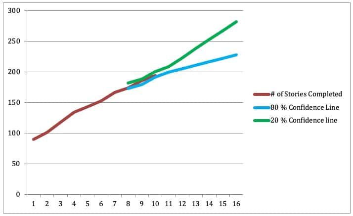
Also, consider ranges. Since we’ve already acknowledged the imprecision of the averaging, we need a way of illustrating the best, worst, and average case scenarios. We do that by charting the following:
- Best three sprints in the past year – this is the highest you’re likely to achieve
- Most recent three sprints – a look at how things have been going recently, you’re 50% likely to achieve this averaged number
- Worst three sprints in the past year – the least you’re likely to achieve

Even this model has a weakness: it assumes your velocity will follow normal distributions. The reality is that you likely won’t. However, forecasting with error bars (or lines) usually gets the idea across that you’re forecasting a range of possible outcomes.
Diagnosis and Improvement
Chart models, in particular a Cumulative Flow Diagram (CFD), can be used as diagnostic tools. A CFD can tell us where the flow of work is getting bottlenecked. We’ve devoted an entire section of our eBook The Guide to Effective Agile Retrospectives to showing a small glimpse of what these tools can do.
Genchi Genbutsu or Go See
Finally, all reports discourage people from leaving their offices and leave us with a false feeling of safety and the sense that we know what is actually happening. Toyota has the practice of Genchi Genbutsu – go and see, literally. Review the model charts, but then leave your office and go to the place of the work. Watch, listen, ask, and review the Portfolio Kanban wall with the team(s). This will bring you back into contact with the reality of which features have been truly done. This will also help you see if all the Story Points in the charts delivered the value that they claimed.
Stop/Do
Stop using RYG reports. They’re too abstract and hide too much information. Do use Burndowns/Burnups/Cumulative Flow Diagrams as a tool to help you spot trends and diagnose issues, but don’t rely on them alone as sources of truth. And most importantly, review the Portfolio Kanban Wall with the Team(s) on a regular basis, as this is your best model of reality.
Further Reading
Glossary: Forecasting
Updated January 2021 from October 2015 original article
Traffic lights image attribution: www.openclipart.org. All other images by Agile Pain Relief.

Mark Levison
Mark Levison has been helping Scrum teams and organizations with Agile, Scrum and Kanban style approaches since 2001. From certified scrum master training to custom Agile courses, he has helped well over 8,000 individuals, earning him respect and top rated reviews as one of the pioneers within the industry, as well as a raft of certifications from the ScrumAlliance. Mark has been a speaker at various Agile Conferences for more than 20 years, and is a published Scrum author with eBooks as well as articles on InfoQ.com, ScrumAlliance.org and AgileAlliance.org.